
Keep & Share: exploring concepts for the future of Wikipedia
Learning is a journey. Currently, Wikipedia is a great resource to support you in your learning journey. In this exploration, I illustrated how Wikipedia could support people through more parts of this journey.
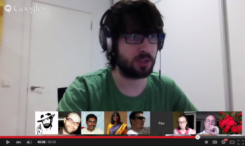
The ideas presented in the video below were discussed and prototyped in unconference sessions at two consecutive recent events in Nairobi and San Francisco (and some airports in between).
Some key ideas illustrated in the video are detailed below:
It’s been a while
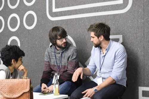
Meeting people in person after a long time. After these last pandemic years of travel restrictions, I’ve been able to meet in person with the different people I collaborate with. Including the Design team in Paris, the Language team in Hyderabad and the San Francisco colleagues in the office.

A blog post about the Wikimedia Design style guide was recently published.
The origin was a conversation with David Golberg about the construction of open participatory design systems and some parallelisms with architecture.
Some resources to get started with design
Last October in a meeting in Bangalore, an engineer of our team asked me about useful resources to learn more about design. It is always great to see interest in design from everyone, but especially from the developers that put together the pieces to build the interfaces for our users.
She half-joking mentioned that I may just recommend UX Design for mobile, the book I co-authored and was recently published. While I’d definitely recommend the book, I decided to compile some of the material that I have been more often pointing to (or sharing excerpts from) in conversations about design with engineers or other newcomers to the design field.
Classic books
There is a vast catalog of design books. The ones below are some classic reads that I’d recommend for beginners in the field:
- Don’t make me think by Steve Krug is a short and easy introduction to usability for beginners.
- About face by Alan Cooper is a comprehensive guide for Interaction Design that introduces the concept of design driven by user needs (as opposed to being dictated by technology). It introduces the notion of user research, design principles, and gets deep into interaction details.
- 100 Things Every Designer Needs to Know About People by Susan Weinschenk compiles interesting findings about how our brains work when perceiving the world or making decisions, and how to keep these considerations in mind when designing for humans.
- Microinteractions by Dan Saffer states the importance of the small interactions that compose a larger system and how to design them right.
- Sprint by Jake Knapp provides a good overview of a pragmatic and condensed design process. As part of Google Ventures they were applying a design cycle in a single week to research, explore, prototype and evaluate ideas for different start-ups.
Even if you don’t get a copy of the above books, there is some interesting material related to them from their websites.
Free resources
In addition to the above books, I also found useful many of the free resources that Internet has to offer. Here is a small selection:
- Mike Monteiro provides an introduction on the role of the designer in an excerpt of the first chapter of his book. His talk about the importance of presenting your work is also very useful for designers and non designers. He has also participated in the Dear design student series which have some interesting posts for people entering the design field.
- The Sketch book by Konigi has good material about exploring ideas in general, and sketching them in particular.
- The course Design: Creation of Artefacts in Society is available for free in coursers. Most of the material can also be read in a free ebook by the professor Karl T. Ulrich.
- Google Material Design and Apple Human Interface Guidelines describe the principles they recommend for their platforms, but they also capture and illustrate some general design good practices.
- UX Myths collects frequent misconceptions about user experience, with links to research. For collections of specific principles you can check also Dieter Ram’s principles of good design, laws of simplicity, or the laws of UX.
- Practical typography is focused on, well, typography and provides both general and more detailed recommendations on typography.
- The HEART framework helps to think on analytics for a product form a user experience perspective.
- The Vignelli cannon captures the perspectives of the well-known graphic designer Massimo Vignelli.
I hope these resources are useful.
Content Translation: impact beyond numbers
In the past I wrote about the design process of Content Translation and how the tool was born. The tool has been growing since then. While still in beta, it is showing a positive impact already as it was highlighted in the recent Wikimedia Foundation annual report.
Last summer the project crossed the milestone of one hundred thousand articles translated. This video celebrates the achievement:
It is really great to see that the tool is frequently used by translators. However, the biggest impact of a tool is not always captured just by numbers.
I was excited to hear that the Medical Translation Task Force was interested in trying our tool. They are a group of users devoted to reduce the language barriers for health knowledge. Having access to essential health information, such as vaccines, can make a big difference on many people’s life.
After a trial, it was amazing to read that they boosted their productivity by 17% by using the Content Translation tool. This means more people will have access to essential information in the language they understand.
Translating articles about vaccines is something I could not have contributed much directly. So it is really great to see how through design you can help others to do so and contribute a bit on relevant but unexpected areas.
Another less known aspect about Content Translation is that by using it you are also contributing for translation services to get better in the future. As you create a translation, your contribution is published as a collection of translation examples (technically known as parallel corpora). This information is publicly exposed through an API and is very useful for researchers and developers of machine translation services in order to improve their approaches or create new services.
Spreading the word
We want to help as many people as possible to break language barriers in their different areas of interest. The possibilities of the Content Translation tool have been discussed in different venues and we are always interested to spread the word more.
Last June we organised an event for the San Francisco design week. I had the opportunity to talk with people from the Google team that worked on the Google Translation toolkit. We had an interesting discussion about the design principles that aligned our tool with the way people translate on Wikipedia.
Santhosh, a member of the Wikimedia Foundation Language team, presented the tool at the Unicode Conference where attendees were interested in the technical challenges the tool solves. Content Translation was also presented to a very different audience at “Translating for EU" an event organised by the Directorate-General for Translation of the European Commission.
The tool has been also used in many other workshops, editathons and university courses around the world. We love to hear your stories about your experience using the tool, so feel free to ping us.
Next steps
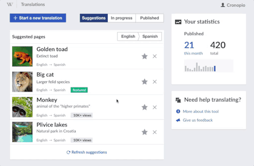
As the tool becomes more mature we are improving several technical aspects but we wanted also to polish different aspects to make the tool more consistent with the evolving Wikimedia design guidelines.
These design improvements include the evolution of the visual design of the tool as well as improvements in some of the workflows such as making the process of starting a new translation more fluent. You can read more about this initial design refresh on the Wikimedia blog.
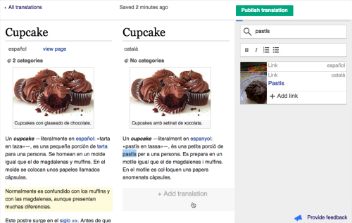
Another area where the tool has been evolving is in template support. Wikipedia uses templates to format content in a consistent way. the infoboxes (tables with quick facts that you can find at the beginning of many articles are just one example).
Initially the tool didn’t provide support for templates because of their complexity. After several explorations we came with a concept based on the same principles we applied to the rest of the tool: supporting translation in a visual way, making it possible to translate as much as you need and getting the support of translation services when available.
Initial research based on a prototype showed it was a promising approach and we added initial support in the tool. There is still a long way to go in this front, but we are happy to have improved already the support of a frequently requested aspect.
In February 2016, I gave a talk in a TEDx event organised by my university in Valencia (TEDxUPValència). The talk (in Spanish with subtitles available in other languages) explored the potential of global collaboration tools and the challenges in their design.
It has been a real pleasure to participate with a great group of speakers and an amazing organisation. You can check the videos for all the talks.
Google SPAN 2015
On November 12 I attended Google SPAN in London. A one-day design event that was also happening in New York two weeks earlier. The videos of most sessions are already available for you to check.
The sessions covered interesting and diverse topics about design. Personally I found very refreshing to hear about the experiences of applying the design process in areas that are far from my day-to-day experience. From the wide range of topics, I especially enjoyed the sessions about Virtual Reality (VR) and designing for kids.

Virtual Reality
Regarding Virtual Reality, two sessions presented two very different but complementary perspectives.
On the one hand, Jessica Brillhart from the Cardboard team at Google explained the challenges of creating films in VR where concepts such as editing and storytelling are getting redefined in this new context.
On the other hand, Ken Wong, the lead designer of Monument Valley, presented the challenges of defining new interactions for users in VR games such as moving objects around to solve puzzles without making the player dizzy.
Designing for Kids
The “Designing for kids” session was both informative and entertaining. Designers working on the Youtube Kids app and those creating the educational kits from Technology will save us, provided us with useful guidelines on how to design for kids: the relevance of visuals, the audience diversity (from all kinds of kids to involving the parents), adapting to their language, avoid dumbing the design down, or considering the responsibility of the product were some of the highlights.
Some of the ideas are available online but it is hard to capture the fun we had in the hands-on session with the electro dough kit.
and much more (in just one day)
Apart from the official sessions, the event was a great opportunity to talk with many attendees. The audience had just the right size to allow both meeting new people all the time to learn from new perspectives on design, but also meet later again to continue interesting conversations. You could find many people passionate about design and working on interesting projects including Google Material design guidelines, digital products from ustwo, motion design on Android, or even hobbyist carpet designers with branding expertise.
It was a great experience to be part of, and I’m happy to see Google Design organising events like this (and doing so in Europe too).
The design of Content Translation
Content Translation is a tool that facilitates the translation of Wikipedia articles. The initial beta version was launched for several languages and it has been used already to create more than one thousand articles.
Designing this new translation experience has been an exciting journey, but before going into the details you can check how the tool works in the video below.
The translation process with Content Translation is quite simple: click on a paragraph to get an initial automatic translation, improve it, and repeat for the next paragraph until you are ready to publish your new article. The tool feels natural to our users and saves them time:
I can now translate a 20-line article in less than 5 minutes, saving lots of time.
However, not so long ago, when I started the design process, a translation tool for Wikipedia was just a blurry idea full of interesting challenges.
The problem to solve: translate the sum of all human knowledge
Translating Wikipedia articles was not a new concept. Multilingual users currently make about 30% of Wikipedia edits. However, little support was provided in the software for the process of translation. As a result, users had to take care of many boring aspects that prevented them from focusing just on crafting great content.
There have been previous attempts to improve this process by big names in the tech industry. Tools such as Google Translator Toolkit or Microsoft Research Wikibhasha are interesting tools in this area, but they didn’t get a wider adoption. As it is detailed next, we think the reason is that these tools were probably too rigid to fit in “the wiki way” of translating.
Design principles: translating the wiki way
What is “the wiki way” of translating? What means to translate in the Wikipedia context? what is different from translating other kinds of content such as technical documentation or user interface messages?
The project started with many unanswered questions, but we relied on the design process to lead the path to clarity. The support and appreciation for design by all the members of the Language Team was key to figure out the right answers. Simplifying the experience for users often means to move the complexity from the user to the software, which the engineers at the Language team always perceived as a challenge worth taking.
During the project we collected a lot of information from many different sources: conversations with experts from the Language team, existing documentation on community conventions and recommendations for translation, research on multilingual users behaviour, and interactions with different members of the community with different expertise in translation (below you can see a screenshot from our round table with some of the early adopters of our tool).
We identified three different user profiles for the tool: the casual translator (a multilingual editor not always confident about the proper way to translate some words or sentences), the advanced translator (focused on increasing the language coverage and expecting a fluent process that does not get in the way), and the new editor (for which translation could be a simpler route to start contributing than starting from scratch). Casual translators represented our main target audience but we wanted to keep a balance between the simplicity new users needed and the shortcuts to speed up the process for advanced translators.
We organised periodic user research sessions to better understand the different user needs during the existing translation process, and to validate new ideas on how to improve this process. We recruited participants through a survey and organised 17 research sessions. Most of the sessions were conducted remotely using Google Hangouts with participants from all around the world.
As the project evolved, we learnt more about the current process of translation, and several ideas were explored on how to improve it. As a consequence, a greater percentage of each session was devoted to the testing of more detailed prototypes. Once the initial implementation for Content Translation was available, it was also included as part of the sessions.
The research sessions were instrumental to understand the particularities of translating in the Wikipedia context, and guided the design of the translation experience. Below you can find some of the principles we applied in the design of Content Translation.
Freedom of translation. There is a significant diversity in Wikipedia content across languages. On average, two articles from different languages on the same topic have just 41% of common content. In contrast to other kinds of content, such as software user interface strings or technical documentation, Wikipedia articles in different languages are not intended to be exact translations that are always kept in sync.
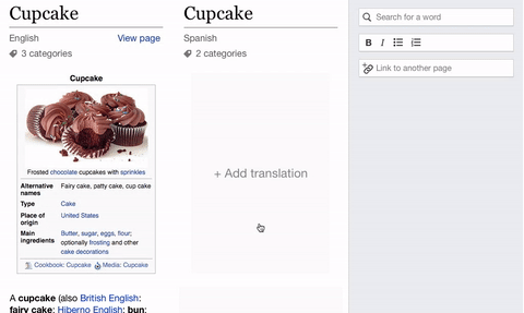
In order to support that content diversity, Content Translation does not force users to translate the full article. Users can add one paragraph at a time to the translation, deciding how much to translate. When a paragraph is added, an initial automatic translation is provided (if it is available for the language), and users are free to correct words, rearrange sentences or start with the source text or an empty paragraph if that is preferred.
Provide context information. In Content Translation, the original article and the translation are shown side-by-side. In addition, each paragraph is dynamically aligned vertically with the corresponding translated paragraph, regardless of the difference in length. This allows users to quickly have an overview of what has already been translated and what has not (with just a single scrollbar). This is one one of those details most users will not even notice because it just feels natural.
Contextual information is provided at different levels to reduce the need for the user to navigate and reorient. When working on a sentence in the translation, the tool will highlight the corresponding sentence in the original document to allow translators to easily check the original context. In addition, when manipulating the content, options such as exploring linked articles (in both languages) are provided to anticipate the user’s next steps in order to make the experience more fluent.

Focus on the translation. During user observations we identified steps in the translation process that could be automated. Users spend time making sure each link they translated points to the correct article in the target Wikipedia, recreating the text formatting that was lost when using an external translation service. They also look for categories available in the target Wikipedia to properly classify the translated article, and save constantly during the process to avoid losing their work.
Content Translation deals with those aspects automatically. When adding a paragraph, the initial translation preserves the text format and links point to the right articles if existing. In a similar way, existing categories are added to the article and user modifications to the translated content are saved automatically.
In addition to removing distractions for the user, it was important to focus on the scenarios the tool was intended to solve, and more importantly, those it was not. Working closely with the product manager we decided to focus on the creation of new articles by a single user. Other scenarios we identified initially (such as multiple users editing in real time the same translation, or extending existing articles) had to wait. Focusing in one scenario allowed the team to iterate faster, provide value to our users early, and learn from the actual use of the tool to inform future steps.

Quality is key. One of the concerns raised early by the participants was about machine translation quality. Several users were concerned about the potential proliferation of low quality content in Wikipedia articles if the translation process was made so easy and machine translation was into the mix.
In order to respond to that concern, Content Translation keeps track of the amount of text that is added using machine translation without further modification by the users. When the amount of text exceeds a given threshold, the users are provided with a warning message. This message is intended to educate the users about the purpose of the tool and to encourage them to focus on quality more than quantity. Finally, if a user publishes an article with a high level of automatically-generated content, the resulting article can be marked for the community to review. So far we have not received complaints on the quality of the articles produced with the tool. After three months of launching only two articles got deleted form 708 translations published.

Exploring solutions: iterate, iterate, and iterate
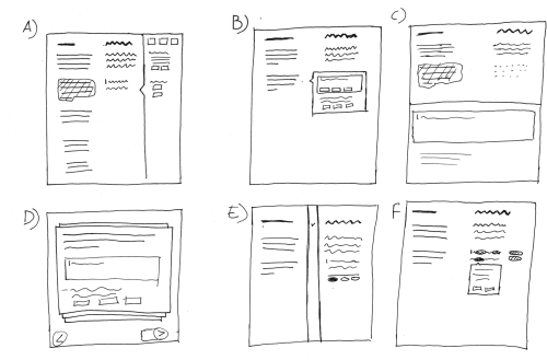
The above principles and solutions were the result of many iterations. We explored multiple options for several aspects from the content layout to how to show multiple translation suggestions. For those explorations I like to apply quick sketching techniques such as 6-8-5, where you timebox yourself to quickly explore as many different design directions as possible. Below is an example of 6 different ways to show language information for the translation content.
Once we had some promising candidate ideas, I prepared some mockups at a higher fidelity level and illustrated how they would work in a video. The video, which was useful to frame the conversations with the Language team, is shown below.
In order to test our ideas with users, we build several prototypes at different fidelity levels (and using different tools). From basic clickable prototypes made with Pencil, to an advanced HTML prototype where users can have rich interactions with the content (e.g., typing and applying different language tools on the content). The later went under 40 revisions to simulate new features based on the testing sessions (including the translations to test with users in different languages). Finally, some small prototypes made with Hype with a very specific focus were created to test aspects such as the card-based layout for language tools or how to add links using text auto-completion.
As the tool was taking shape, the design team at the Wikimedia Foundation was also growing. This resulted in feedback from all my great colleagues that was very useful to improve the tool, review the testing process, and make the designs better aligned with the general design direction for Wikimedia projects.
More details on the design of Content translation can be found at the project page and on this research paper.
Next steps
Content translation has the potential to reduce the language barriers in Wikipedia. Currently the amount of knowledge you can access depends heavily on the languages you are able to speak. Although it has been a great start, there are many pending steps in this road.
For the initial stage of the process, covered in this post, the main focus was to create a translation editor that made translation easier and faster for our users. Our results show that once users start a translation with the editor they are able to complete it successfully and users are happy with it.
The goal for the next stage is to bring new users to the translation process and keep them translating by helping them to find interesting content to translate. Some of this work has already started with the great help of Nirzar Pangarkar and is showing already an increase in the number of translators using the tool, but there are many questions yet to be answered.
You can get the latest news about Content Translation through this twitter account, and if you are around Mexico this summer we can discuss more details about the design of the tool during my talk at Wikimania 2015.
An example illustrating the side-effects that affect Em units when used for text and spacing.
A smartwatch concept using stripe-based interaction
The smartwatch is a reality. However, most of the smartwatches available are based on the same display-centered paradigm: attaching a small touchscreen to your wrist. While this approach brings some benefits, it seems to move us one more step towards the world of perpetual distraction.
The wrist watch is an orientation device. It allows humans to determine in which point of time we are. We look repeatedly to our watches to reorient ourselves in time and combine it with other data points from our daily activities: “What time is it? Ok, it’s 10:30, still 30 minutes before the meeting on the 6th floor.”
I was interested in ways to augment existing watches with the minimum digital information. Connecting our regular watch with the digital world just enough to improve our experience, but still keeping us in control of our time (which seems appropriate when we think about a watch). That is how Cronopio, my smartwatch concept, was born.
Cronopio: a smart watch concept with time in the center
Instead of making a display full of notifications as the central element, a regular watch is at the core of the concept. The interaction happens around it, at the bezel of the watch. A digital border augments the regular watch with small markers. These markers can communicate upcoming events like a meeting or indicate the directions to get where the meeting will be held.
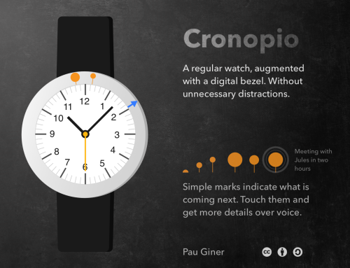
The markers convey information with simple geometric shapes that are visually aligned with the time marks of the watch sphere. For example, a circle indicates the presence of an event, and an arrow shows directions to get there, like a compass. Animation and color are used to highlight relevant information and the user can interact with them to get more details by voice.
Stripe-based interaction
Displaying information in a simple and space-effective way was one of the challenges of the smartwatch design exploration. I tried to imagine how would be a UI toolkit optimised to be displayed in a thin stripe area (either straight or circular). Hence, I referred to the general idea as stripe-based interaction.

The animation above shows an example of simple markers supporting different interactions. It’s interesting to think which other interactions are possible following this model and their applications: Augmented sport wristbands? Interactive car steering wheels? Smart pens? or even a watch just consisting of a thin stripe?
There are lots of possibilities for stripe-based interaction considering the minimal surface required opens a lot of possibilities. The big challenge is to make good use of the small bits of information, but apps like Yo show that information even in the smallest forms can be worth communicating.
…and all for free!
As you can see, this is no more than a very rough idea. If you are interested, you are welcome to take it and move it another step forward or discuss the idea. To make it easy, all the above designs are licensed under Creative Commons Attribution-ShareAlike.
The name Cronopio is inspired by the imaginary creatures form the short stories by Julio Cortázar.